Over the past few years I have worked on a lot of projects at my job as both designer and front-end. Almost everything that I had a hand in was undoubtedly different but with every new product published one thing became clear: we needed a better way to unify and extend our corporate design and ui patterns. With this goal in mind I began to build custom CSS libraries * for each new project. The idea behind this was to identify common ui patterns and establish a basic design “alphabet” which could be used to construct prototypes and ready-made products on the fly… before diving into design details and product requirements.
Sounds familiar? Of course it does! Twitter’s Bootstrap and Foundation by Zurb have done this in the most general way possible. Meanwhile r/frontend and r/web_design argue on an almost monthly basis about what css library is best and if you even need to use them — because you’re a strong independent css purist who don’t need no frameworks, I mean libraries *…
*Bootstrap and other systems like it are libraries. There, I said it. A framework is a system that you learn and work within, using its own opinions on how to do things especially on the application level (angular js is a front-end framework). A library is a collection of things that you can use immediately within your project with little time invested into learning them, it is not heavily opinionated. In other words: a framework is a way to do it, a library is a tool to do it with.
Typically I would agree that you shouldn’t lean on any one css library, you’re much better than that! If you had asked my opinion on this matter three years ago I would have turned my nose up and called you a css pleb; however, we all grow up someday and drop the name calling (I’m a strong independet designer who don’t need no judgement!).
So here I was looking at several projects going at the same time and only enough of my attention to juggle two a week before going insane. As described above I took the most common ui patterns, design components, and corporate identy from each and every project that I worked on for the last couple years and began to build a css library. Thanks to SASS, for dragging us out of the css stone age, this task was a lot easier to accomplish which allowed me to focus more on the philsophy and streamlining of our design “alphabet”.
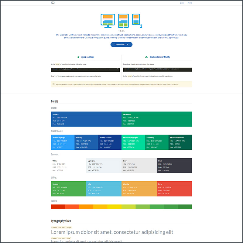
The end result:
I’m only showing the image of the documentation page because this project is very much internal and still under constant revision (I plan on keeping it that way). In the begining I constructed the library completely from scratch, down to the css grid system. Outside of the css grid and forms there were a plethora of buttons and many other custom controls. It felt very heavy and tired. Right around this time a bunch of micro css libraries started to popup, some of my favorite ones were Sierra Library and another one that I can’t remember (for shame!). I liked the much simpler approach those libraries took: use an existing grid system and add very minimal custom css around it (forms, buttons, etc.).
With this I cloned an existing library, stripped out the stuff that wasn’t needed, kept common and important components (global variables scss file: grid, flexbox grid, colors, etc… adjust everything!). Once I had something that was lean and stable at the core, and modified for our corporate identity I added the ui patterns and some design components. Most importantly I converted everything to BEM and introduced my own favorite class type: global modifiers. Global modifiers are classes that modify everything from the layout of elements (block level and inline) down to colors and behavior. Basically they are helper classes on ‘roids. This was incredibly important in light of the fact that other developers (mainly backend) were going to be using this library for their layouts and to promote BEM-type class handling by removing the fear of the “long class attribute”.
Since launching the new library several projects started to pick it up with little to no cross-training at all. I’m working on adding more JS components for future releases as well as more robust documentation. Speaking of documentation, currently the setup is simply a page of library components with sparse class names and reliance on dev tools to view the markup structure. The feedback has been constructive and so very important, hopefully because of this the library achieves longevity and will see many version cycles.
Thanks for reading, until I write stuff & things again, I’ll catch you on the flip side.
