A couple months ago I was approached to develop an identity system for a new and exciting business located in Fresno California. Green Office Furnishings specializes in used office furniture re-sale as well as providing showrooms and options for brand new designer pieces. Needless to say I was very excited, besides I decided to look for a file cabinet that same week (it was all meant to be).
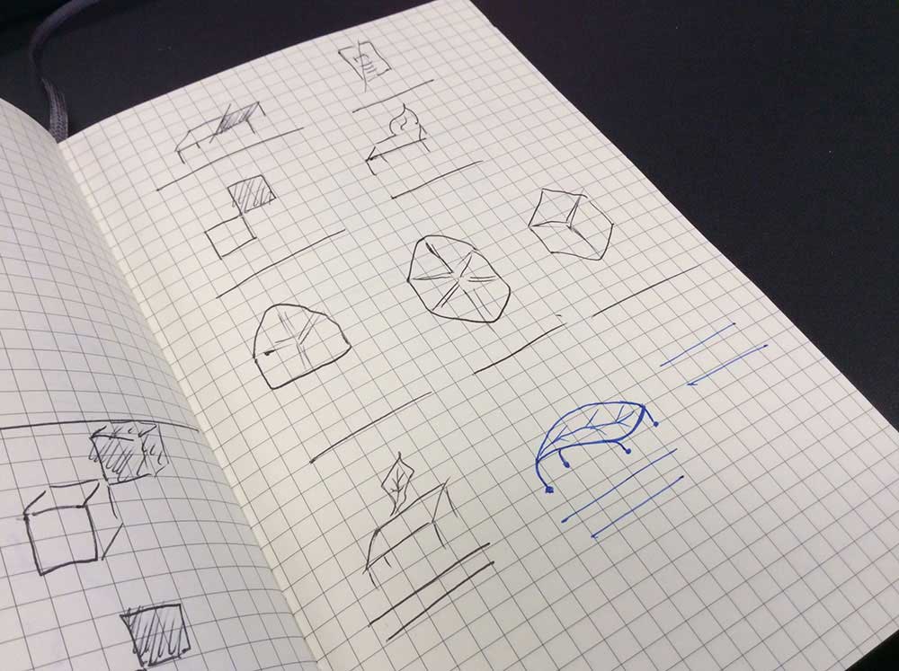
As with all identity projects and all creative projects in general, it started with ink on paper.
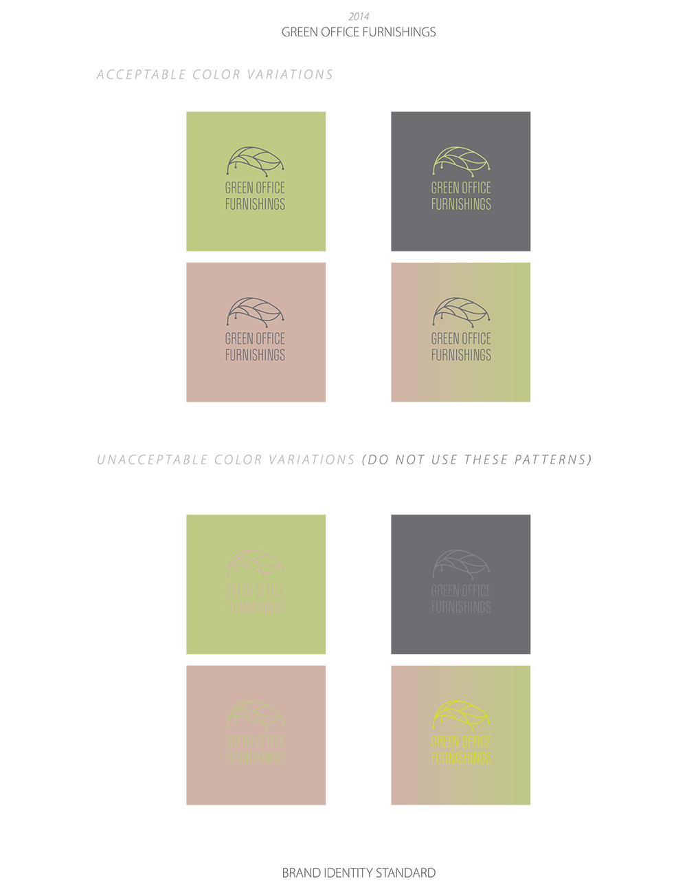
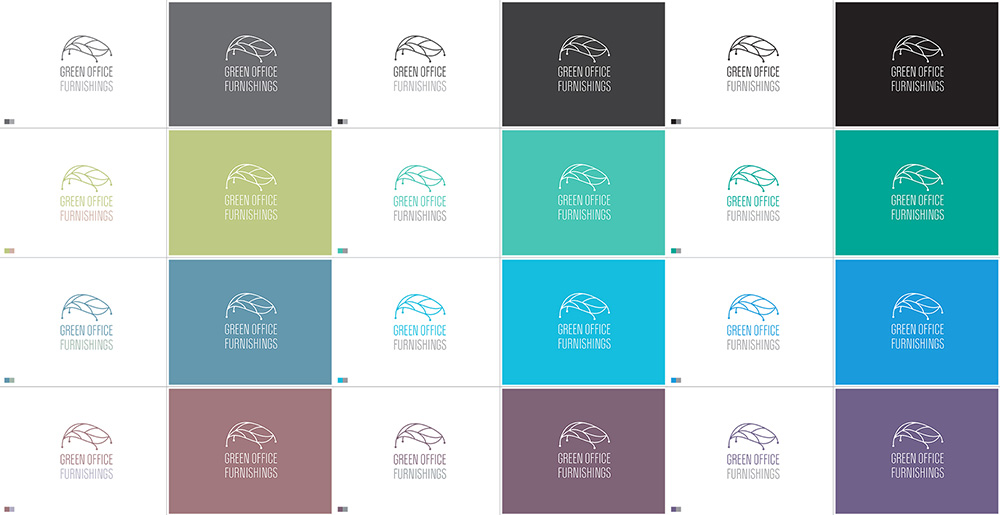
Removing a few steps in my process here is the color variations practice for choosing the right color for the brand. I tend to give a lot more options than what I think is needed to help my clients narrow down and explore paths that they might not have thought of prior to seeing the logo in color (everything else up to this point is strickly black and white).
The main idea behind the concepts was to actually implement a symbol of nature with a man made product. It’s easy to just slap some green color on a business name and call it a day, but that’s not exactly exciting for anyone, especially not for me. One solution was to literally morph a leaf with a table, think of an artisan piece of furniture that cartoonishly uses a leaf for it’s tabletop.
This direction led me to think about industrial materials, especially ones that are relatively easily manipulated into any shape. Cast iron became readily available during the industrial revolution and was a popular material during Art Nouveau allowing for “moving” lines to be expressed in interior structures such as the Stairwell of Tassel House by Victor Horta
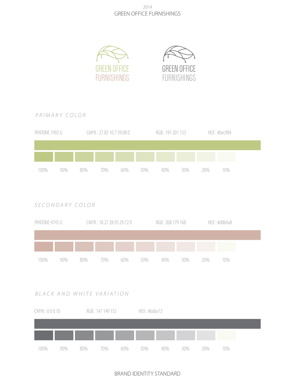
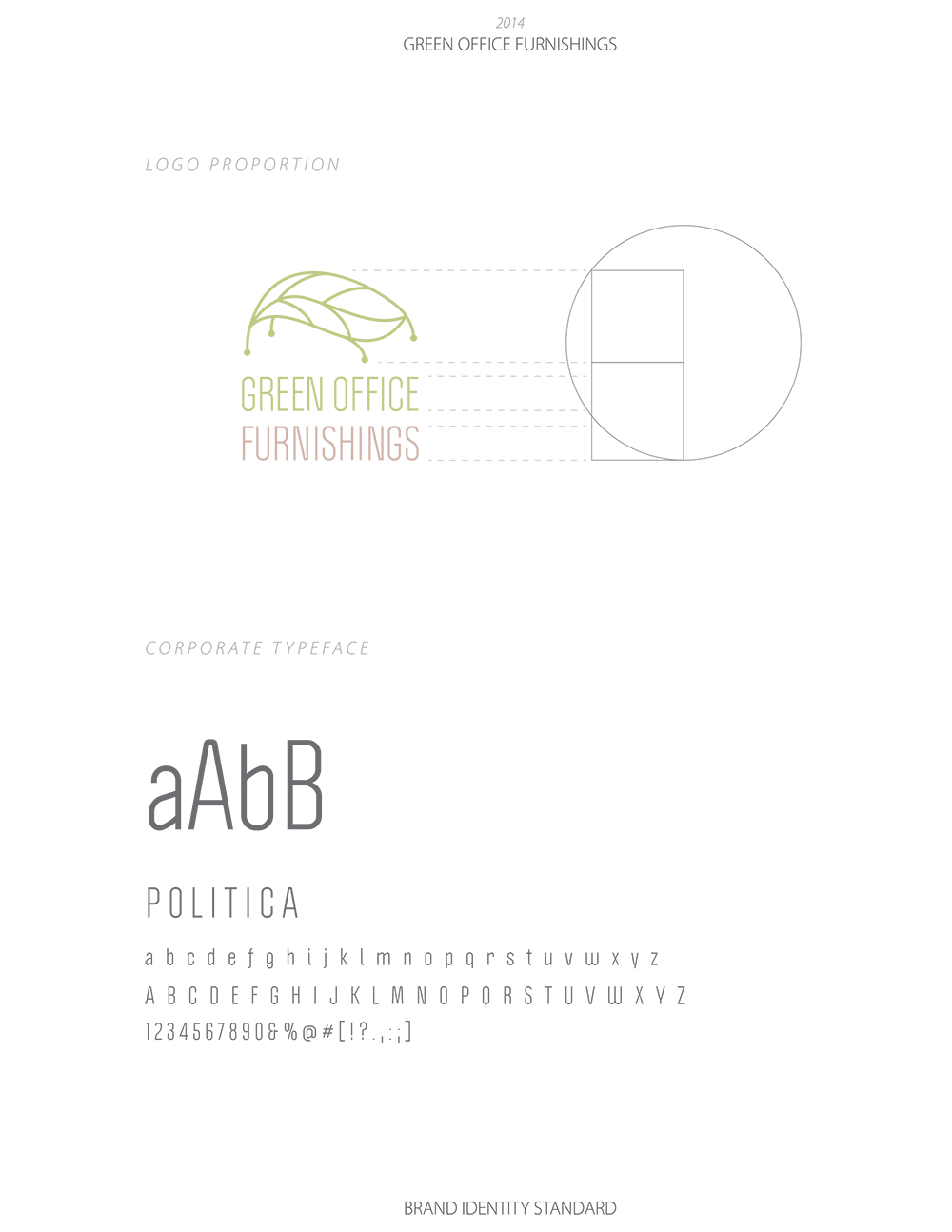
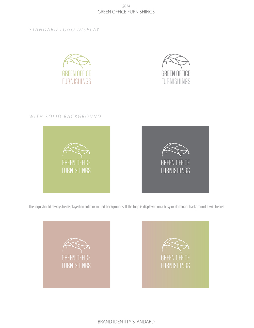
Here is Green Office Furnishings complete with my typical identity system presentation.