This morning a story on Linkedin’s premium member profile page redesign caught my eye, and I’m sure I wasn’t the only one intrigued by it. I actually got pretty excited since Linkedin’s current design, especially mobile, is very specific to the purpose that it serves including solving its original problem: present a virtual rolodex and basic resume in an appealing manner within the social media framework. Having said that, there’s always room for improvement and any news about it is not exactly a small story.
As I read the following excerpt from Mashable on the redesign my enthusiasm started to sink to a rather low orbit.
The new look is similar in style to other major social networks like Facebook and Twitter, which are becoming more visual in their designs. - Kurt Wagner in “LinkedIn’s New Profile Design Takes a Hint From Facebook and Twitter”
The first part of that quote suggests the initial source of my disappointment: nothing new to see here, just another Facebook design on another name.
Second part of that quote is more annoying than disappointing: becoming more visual in their designs? What does that even mean? Design is inherently visual, so it can’t be “more visual” due to the fact that visual itself is a constant value of design. Have I over explained this enough?
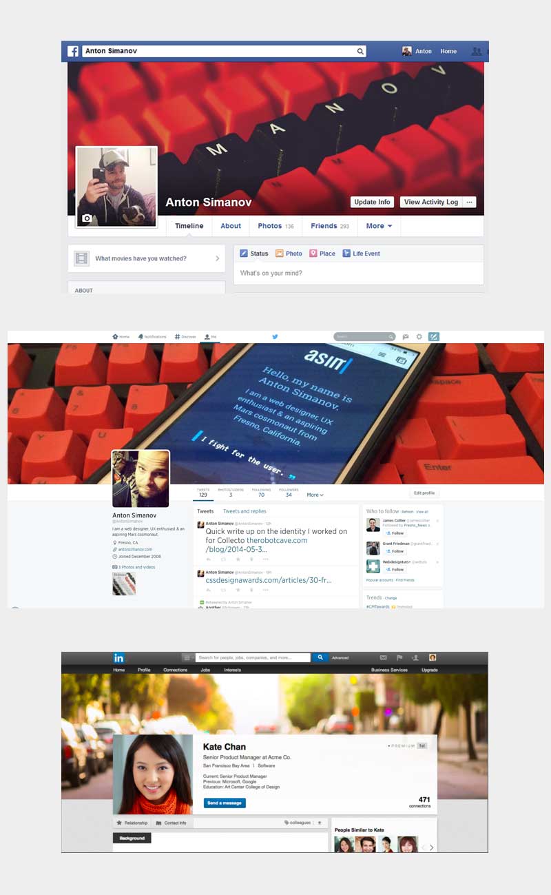
Looking at the above image is like looking at LogoLounge yearly trend report but more dull. Three of the biggest social media sites are virtually identical in layout, yet all cater to a different type of user.
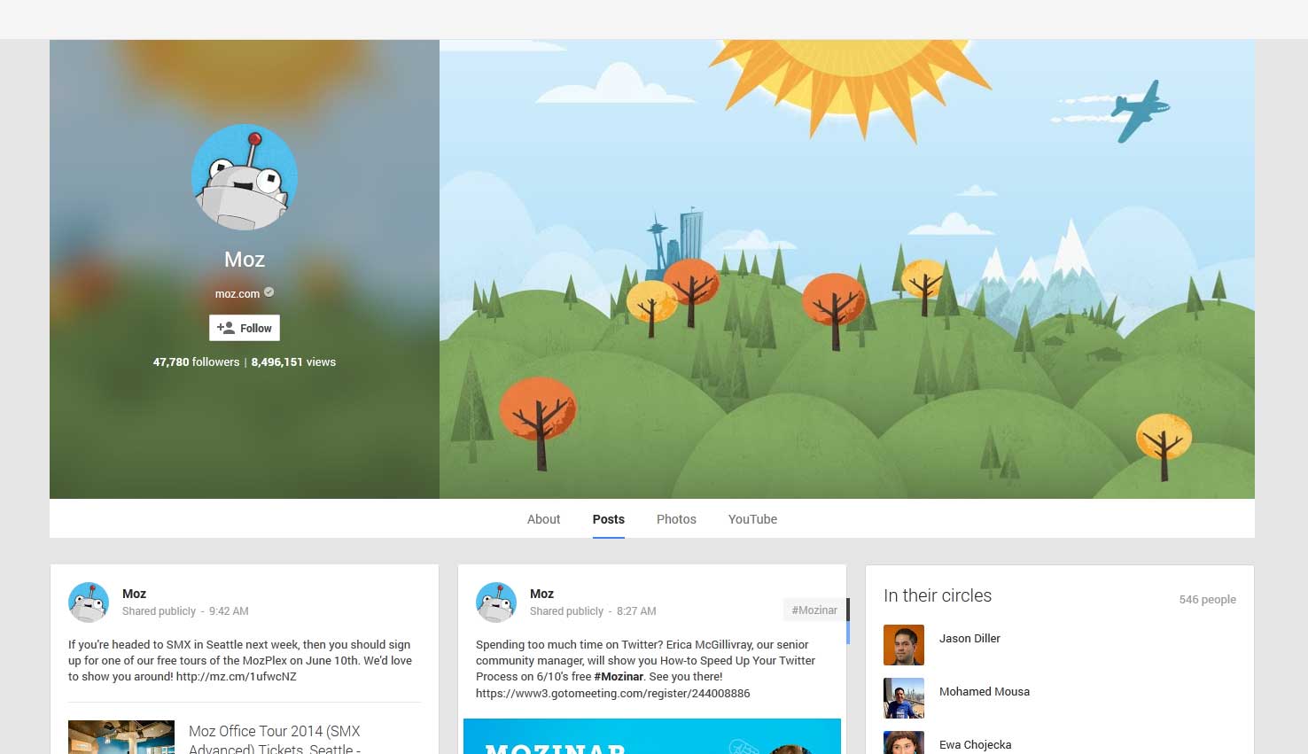
It’s not all doom and gloom in the sharing community. One unsung hero that barely gets used, well at least with respect to overall activity not what’s actually reported by Google, is G+. I’ve never pegged Google for great design but I have to hand it to them for keeping it real and not following the status quo of large (almost full width) banner with a square profile picture covering part of it followed by a 3 column content layout.
In today’s age of design trends it might appear silly to bash such a general layout choice but when every major service starts blending into one instead of visually competing the design scape becomes stale and in many cases even confusing.
Here’s an example of what the current Linkein design needs to take a step in the right direction on its own path: Josh Mateo’s Linkedin Redesign Concept